NielsenIQ via 3Pillar Global · Enterprise data · 2021
Helping analysts find the right slice of 3 trillion data points
NielsenIQ measures what people buy in more than 90 countries for over 23,000 enterprise clients. One of its core analytics platforms had not been redesigned in more than 15 years. I designed the new data selection experience: how analysts choose markets, products, periods and measures before they run a report.
Project facts
- Role
- Senior UX/UI Designer, 3Pillar Global
- Client
- NielsenIQ, Oxford, United Kingdom
- Users
- Data analysts at multinational companies
- Deliverables
- Structure, interaction patterns, UI and annotated specifications
- Timeline
- 2021
Scale
- 15+ yearssince the platform was last redesigned
- 23K+enterprise clients served by NielsenIQ
- 90+countries covered by its data
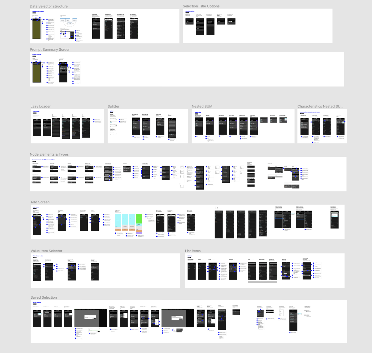
The problem
Before an analyst can answer "how did our brand do in Germany last quarter?", they have to tell the system exactly which markets, products, time periods and measures they mean. Each of those is a deep hierarchy with thousands of items. In a platform built 15 years earlier, that selection step was slow, hard to scan, and easy to get wrong without noticing until the report came back.
The challenge was to modernize it for expert daily users without breaking the habits they relied on, and to make it handle very large amounts of data.
Approach
I started with the structure rather than the screens: what a selection is made of, how items nest, and what an analyst needs to see at each level. From there I designed a small set of reusable patterns that work for any data type, so markets, products and periods all behave the same way.
Key patterns
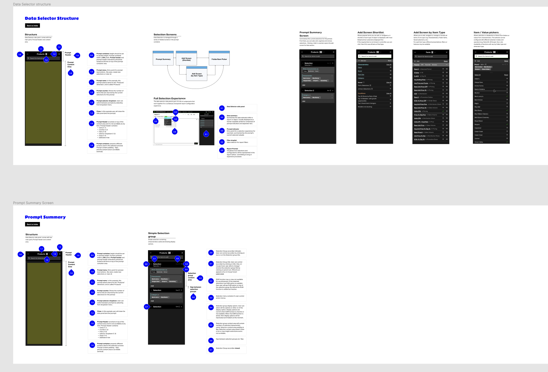
Data selector with multi-selection
- What it does
- Lets analysts browse or search a hierarchy and pick many items at once, with the selection always visible next to the tree.
- Why
- Analysts rarely want one item. Showing the running selection prevents the most common mistake: running a report on the wrong set.
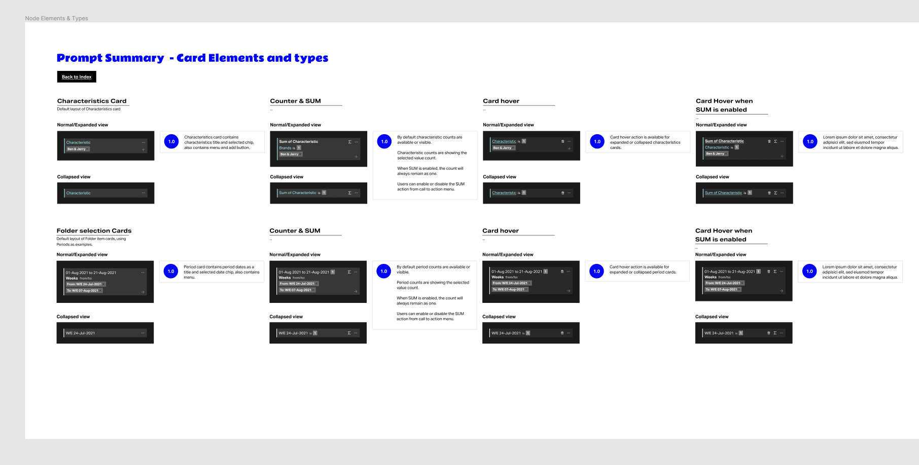
Prompt summary
- What it does
- A summary of every choice as compact cards, one per dimension, which analysts can review and edit before running the report.
- Why
- It turns a long setup into something that can be checked in seconds, which matters when a wrong report costs hours.
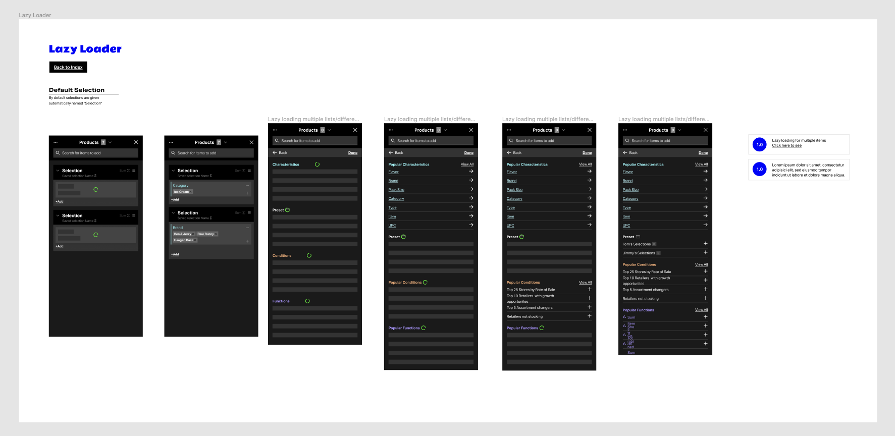
Lazy loading and search selection
- What it does
- Large lists load progressively as the analyst goes deeper, and search jumps straight to items anywhere in the hierarchy.
- Why
- Hierarchies with thousands of nodes cannot load all at once. The interface needed to stay fast without hiding data.
Handoff
Every pattern was delivered as an annotated specification: structure, states, element types and behavior, numbered so engineers and product analysts could reference exact details in tickets. The lazy loader, for example, was specified from the first empty state to a fully loaded list.
Reflection
With expert users, the best redesign often feels familiar. The work was less about new visuals and more about removing the moments where analysts had to remember, recheck or guess. Designing patterns instead of pages is what made that possible across so many data types.
Next case study
Appex: leading UX across 10+ fitness appsContact
Hiring a Lead UX Designer? Let's talk.
I'm open to Lead and Principal UX roles, remote or based in Bucharest. The quickest way to reach me is email.