Flip · E-commerce · 2023
Fixing the last three steps before a sale
Flip sells refurbished phones and laptops in four European markets. I redesigned the cart, added an accessories upsell step and rebuilt checkout as one connected journey. Accessory attach rate went up 27% in ten days, and completed checkout sessions went up 23.4%.
Project facts
- Role
- Lead UX Designer, end to end: research, flows, UI, testing, handoff
- Company
- Flip, circular-tech e-commerce, 650K+ users
- Markets
- Romania, Bulgaria, Greece, Hungary
- Team
- Product, Growth and Engineering, plus the departments behind services and fulfilment
- Platform
- Mobile and desktop web
- Timeline
- 2023
Results
- +27%accessory attach rate in the first 10 days, across 3 countries
- €43.6kadded revenue from the upsell step in those 10 days
- +23.4%completed checkout sessions
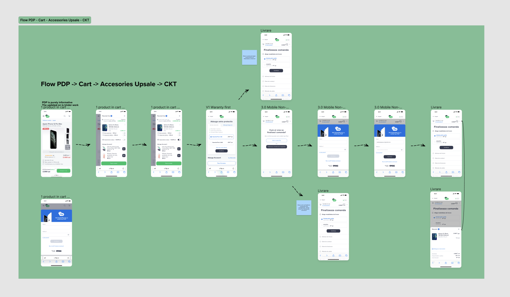
The problem
Flip was growing fast, but the path from "add to cart" to "order placed" had been built one piece at a time. Google Analytics showed long checkout sessions, frequent field errors and a low conversion rate. Accessories and extended warranties were rarely added to orders.
The brief had three goals that pulled against each other: sell more accessories and services, shorten checkout, and do both without hurting conversion.
The data showed users going back to fields about 8 times per checkout session. Errors only appeared after tapping "Complete order", so people fixed one problem, submitted, and found the next one.
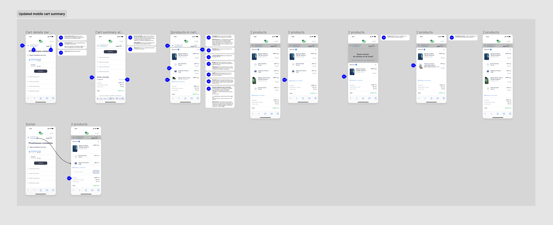
1. Cart: make the decision easy
The cart had to answer the questions people ask right before paying. I leaned on proven e-commerce patterns here rather than new research, and saved research time for the upsell and checkout.
- Delivery date up front. Delivery time was one of the biggest factors in the purchase decision, so it moved to the top.
- Clear product summary with an easy way to remove items.
- Services as a simple toggle. Warranty and insurance could be added without leaving the cart.
- Relevant accessories. Recommendations came from the backend based on the device in the cart.
2. Upsell: a dedicated step, not a pop-up
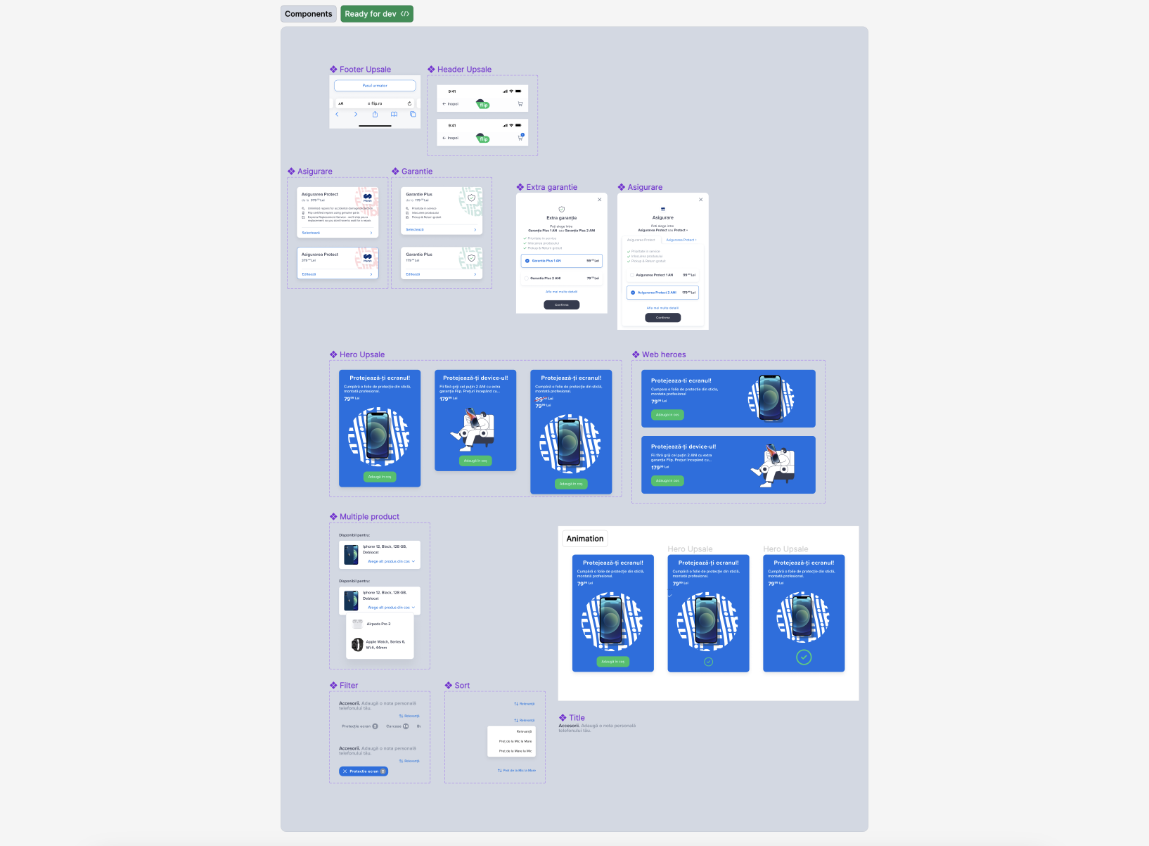
Before designing, I ran research across departments to understand which accessories and services mattered most to customers and to the business. The result was a short, dedicated step between cart and checkout.
Decision: a full step instead of a modal
- Why
- A modal would block the path to checkout and train people to close it. A step with a clear "Continue to checkout" button made adding something optional and skipping it effortless.
- Trade-off
- One more screen in the funnel. The goal from the start was to raise attach rate without lowering conversion.
The page had four parts:
- One featured product or service that could be added with a single tap.
- Configurable services, such as 12 or 24 month warranty.
- Accessories with filters: cases, cables, batteries, screen protectors.
- A persistent continue to checkout button.
User interviews on the prototype led to a round of small adjustments before handoff to development.
3. Checkout: one question at a time
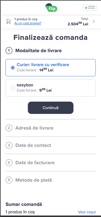
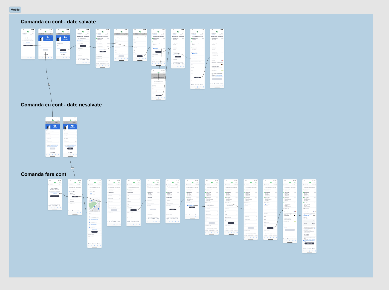
I grouped everything checkout asked for into five topics: delivery method, delivery address, contact details, billing details and payment. Then I worked with the product team on a stepped checkout.
Decision: validate each step, and each field as you type
- Why
- Inline validation shows a problem while the person is still in the field, instead of after they submit. Each step is checked before moving on, so "Complete order" no longer surprises anyone.
- Trade-off
- More screens. Short steps, a visible step counter and a persistent order summary kept the checkout feeling short.
Decision: remove the exits people took by accident
- Why
- Removing products and navigating back from inside checkout caused sessions to end by mistake. Those actions stayed in the cart, one tap away through the order summary.
- Trade-off
- Slightly less flexibility inside checkout, in exchange for fewer abandoned sessions.
I designed three paths: signed in with saved details, signed in without saved details, and guest checkout. I tested the prototype with users before handoff.
Results
- +27%accessory attach rate in the first 10 days, in 3 countries
- €43.6krevenue from the upsell step in the same 10 days
- +23.4%completed checkout sessions, with less time spent and fewer errors
Reflection
Designing the cart, upsell and checkout as one system mattered more than any single screen. If I did it again, I would run the cart changes as an A/B test too. We relied on best practice there to move fast, and a test would have shown how much the cart contributed to the checkout gains.
Next case study
Rebag: luxury resale, web and appContact
Hiring a Lead UX Designer? Let's talk.
I'm open to Lead and Principal UX roles, remote or based in Bucharest. The quickest way to reach me is email.