Rebag · Luxury resale · 2019 to 2022
Making a $4,000 bag easy to buy on a phone
Rebag is a New York luxury resale marketplace with 1.5M+ users. Over three years I redesigned its webshop, cart and checkout, and native apps. The product page redesign alone raised yearly revenue from that page by 17%.
Project facts
- Role
- Senior UX/UI Designer on the Bucharest team working for Rebag
- Partners
- VP of Product, Marketing and engineering teams in New York
- Scope
- Webshop, cart and checkout, iOS and Android apps, editorial hub, UI kit
- Timeline
- August 2019 to September 2022
Results
- +17%yearly revenue from the product details page
- +10%checkout completion
- +22%session duration
- 4.1 → 4.6App Store rating within six months
Context
Buying pre-owned luxury online is about trust. People are spending hundreds or thousands of dollars on an item they cannot touch, from a seller they may not know. Every screen has to answer the same questions: is it authentic, what condition is it in, and is this a good price?
I worked with Marketing and Product through user interviews and usability tests, and directly with the VP of Product and the New York engineering team on releases.
Webshop: menu, search, listings and product pages
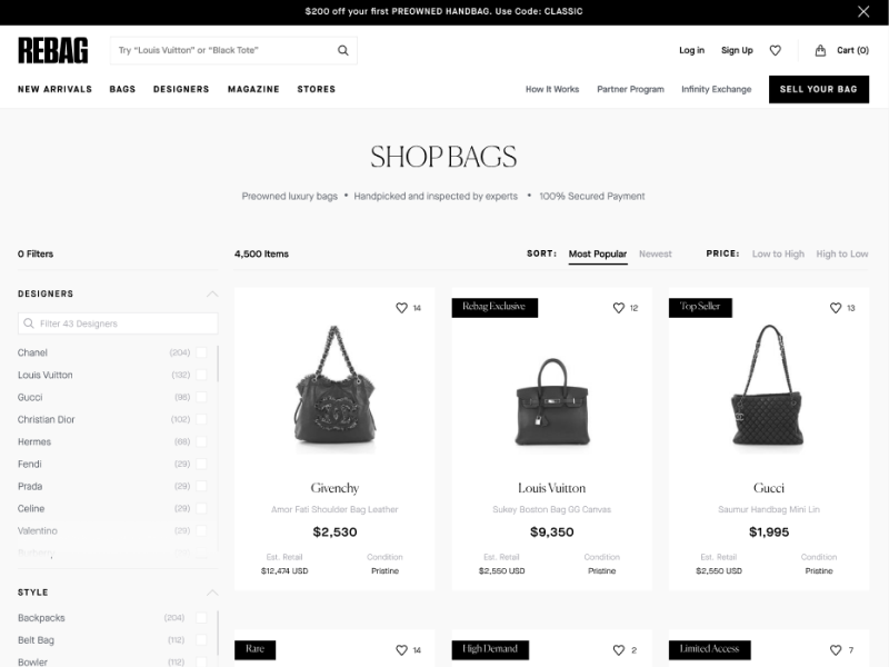
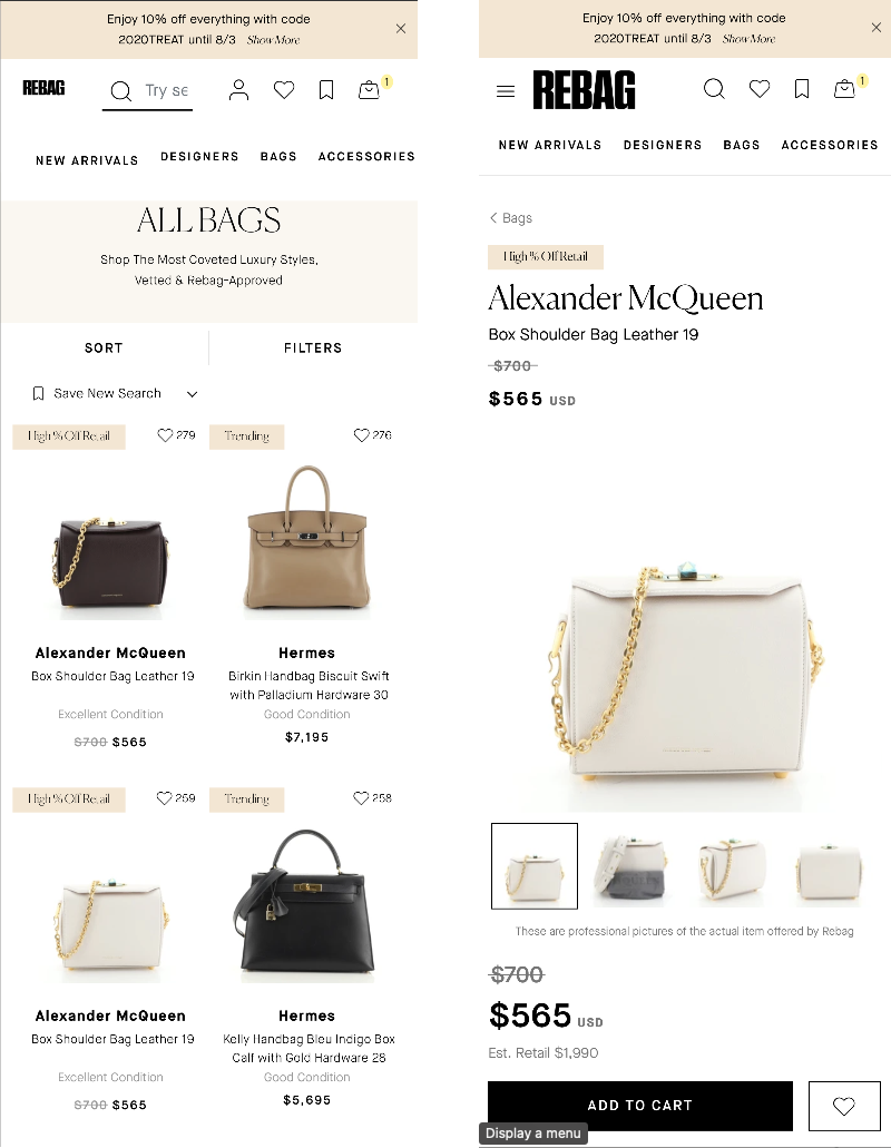
The work covered four areas: a new mega menu that could show categories, previews and promotions; search, as a main entry point for buyers who know what they want; the product listing page; and the product details page. Along the way I built a UI kit and style guide so the redesign could scale across teams.
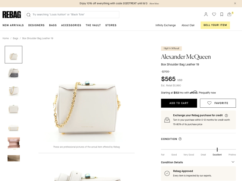
Decision: put condition and value next to the price
- Why
- On a resale product page, condition and savings are part of the price. The redesigned page groups price, original price, condition and Rebag's exchange offer next to Add to cart, so buyers can judge value without scrolling.
- Result
- Yearly revenue from the product details page grew 17%, which meant millions of dollars in additional revenue.
Cart and checkout, mobile first
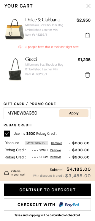
Rebag's cart had to hold a lot: item details, promo codes, gift cards and Rebag credit from previous sales. The goal was speed without losing clarity on a small screen.
- Honest urgency. Each item shows how many people have it in their cart right now, which is real information for one-of-a-kind items.
- All discounts in one place. Promo codes, gift cards and Rebag credit are applied and removed in a single block, with the new total shown next to the original.
- Three clear steps, Address, Shipping method and Payment, with a progress indicator and an order summary.
- Errors caught early. Inline validation with plain-language messages, address autocomplete and a "remember my information" option.
Together with the navigation changes, this raised checkout completion by 10% and session duration by 22%.

Native app: one experience across web and mobile
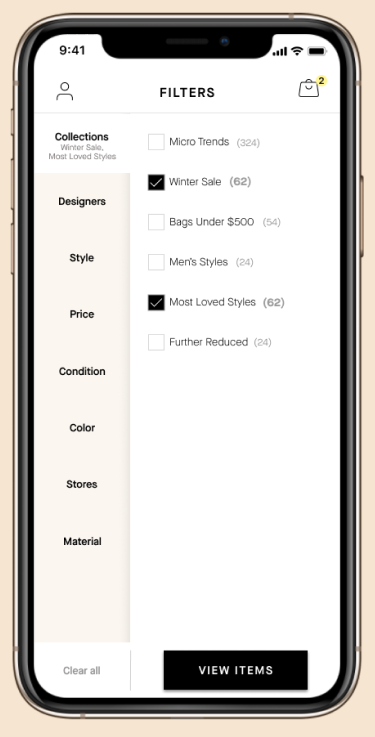
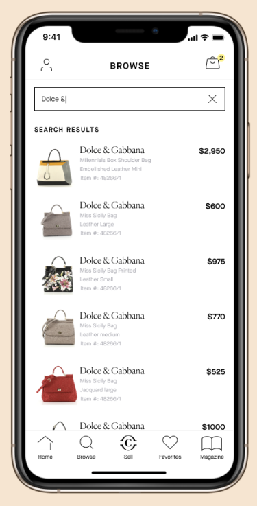
After the webshop, I led the redesign of the iOS and Android apps so they matched the brand and the new web experience. Instead of starting from wireframes, I adapted the proven web patterns to the app's framework and focused on navigation, the homepage, search and My Account.
- A filters screen organized by collection, designer, style, price, condition, color, store and material, with item counts.
- Search with suggestions and autocomplete, since many buyers arrive knowing the designer they want.
- Accessibility and interaction improvements across the app.
The App Store rating went from 4.1 to 4.6 within six months.
Also for Rebag: The Vault
I also designed The Vault, Rebag's standalone editorial hub. It organizes years of articles into categories, features video, and links stories to products through recommendation carousels, so content drives both retention and revenue.
Reflection
Three years on one product taught me how much trust is built in small details: a condition label, a price comparison, an error message that explains what to fix. The biggest gains came from making value clear, not from adding features.
Next case study
NielsenIQ: renewing a 15-year-old analytics platformContact
Hiring a Lead UX Designer? Let's talk.
I'm open to Lead and Principal UX roles, remote or based in Bucharest. The quickest way to reach me is email.